The ACT Science section tests your knowledge of how to read and interpret data through graphs, tables, and diagrams. This data is integrated into the 6 passages on the Science section, and understanding how to quickly interpret it is key to getting a good score.
You can practice this skill by taking practice tests and familiarizing yourself with the kinds of data you’ll see on the ACT Science section. Again, there are three ways data is displayed on the ACT Science section: through Graphs, Tables, and Diagrams.
How to Evaluate Data on the ACT Science Section
In order to evaluate data on the ACT Science Section quickly, you’ll need to note three key parts of the data: units of measure, axis labels and increments, and trends. For example: What are the variables? What units are the graph using? Is the graph or table showing multiple experiments? Is there a trend?
In order to evaluate data on the ACT Science Section quickly, you’ll need to note three key parts of the data: units of measure, axis labels and increments, and trends.
It’s important to give the data a good scan and note the details above on your first pass through the passage, so that when it comes time to answer questions about the data, you will have a good grasp of what it is showing and will only have to give the data a cursory glance to find the correct answer.
Tips for Increasing Speed on the ACT Science Section
Examples of Graphs on the ACT Science Section
Graphs on the ACT will usually show up as bar graphs, line graphs, and scatterplots. On each kind of graph, the y-axis usually displays what is being measured (the dependent variable) and the x-axis shows what is being manipulated (the independent variable). If there is a key attached to the graph, take note of what it says, as it will help you interpret what is displayed in the graph.
Bar graphs
A bar graph is one of the most straightforward methods to display information. The example below shows a triple bar graph displaying three sets of data with the same dependent variable.
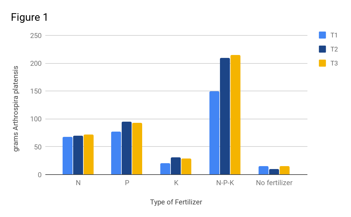
Bar graph example (via The Olive Book)
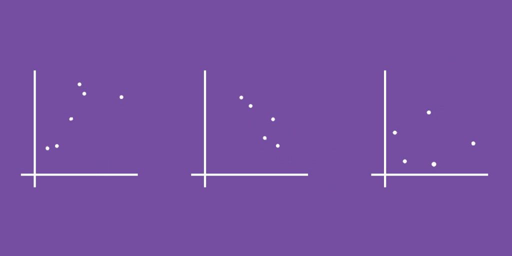
Scatterplots
Scatterplots show the relationship between two sets of data through individual “plots” on the graph. These plots may or may not be connected with a line of best fit, which models the way a set of data is increasing or decreasing.
The data has a positive correlation, trending up, if the slope of the line is positive.
The data has a negative correlation, trending down, if the slope of the line is negative.
It is possible for data to have no correlation when the data is so spread out that it neither trends up nor down.
Scatterplot example (via The Olive Book)
*What trend is displayed in the above scatterplots? (scroll to the end of the post for the answer!)
Line graphs
Line graphs display data as a solid line on a graph. This line can be straight or curved. Sometimes you’ll see just one line on the graph – but it is possible to display multiple sets of data in one line graph, creating a graph like the one below:

Line graph example (via The Olive Book)
Region graphs
Region graphs are not quite as common on the ACT, but do show up for some students. A region graph shows different scientific properties as regions (areas) on a chart.
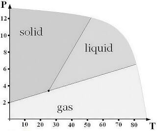
Region graph example (via Magoosh)
Examples of Tables on the ACT Science Section
You will also see tables on the ACT Science section. Tables show information in rows (horizontal) and columns (vertical). Take note of the column and row labels. What units of measure are being used?
| Group 1 Remote fan Remote compressor | Group 2 Local fan Remote compressor | Group 3 Local fan Local compressor | |
| “Very quiet” to “Quiet” classrooms | 60% | 83% | 47% |
| “Somewhat quiet” to “Somewhat noisy” classrooms | 40% | 17% | 41% |
| “Noisy” to “Very noisy” classrooms | 0% | 0% | 12% |
Table example (via The Olive Book)
Examples of Diagrams on the ACT Science Section
Diagrams are another kind of data on the ACT Science section. Diagrams can be anything from food webs to a lab setup, or a figure displaying solar geometry, as in the example below. There is usually more text than numbers in these diagrams. Pay attention to labels, titles, and/or captions that accompany the diagram for clues as to how to interpret it.
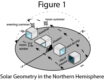
Example of an illustrative diagram (via The Olive Book)
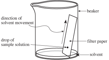
Example of experiment set-up (via ACT.org)
Remember the Three Key Parts of Data
As you review and study data representation on the ACT Science section, remember to practice noting the three key parts of the data: units of measure, axis labels and increments, and trends. Once you become skilled at identifying what the data is saying and how it’s saying it, you’ll be on your way to owning the ACT Science section.
Further reading:
Strategies for the ACT Science Section
Science Literacy Study Guide for the ACT
How is the ACT Science Section Structured?
The Three ACT Science Passage Types
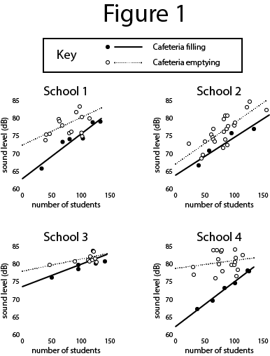
*The scatterplots all display a positive trend. However, take a look closer at the data – did you notice that the cafeteria is always louder when the students are leaving as compared to when it is filling, even when identical amounts of students are present? Why might that be? (This is the kind of information to take in as you scan a graph!)